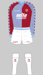
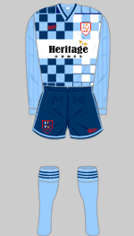
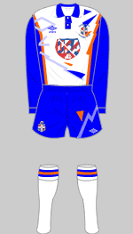
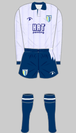
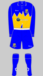
Aston
Villa 1987>>
Hummel introduced these complicated halved shirts
with fine stripes after the Danish national side wore a
red and white version in the 1986 World Cup finals.
Coventry and Southampton wore similar kits.
|
|
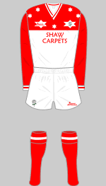
Barnsley
1989>>
This Yorkshire club has always been associated with
no-nonsense, plain red shirts, aside from this bizarre
creation dating from 1989-90, known as the "star-strip."
|
|
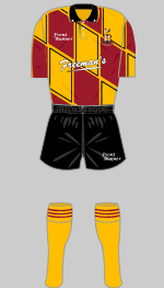
Birmingham
City 1992-1993>>
In the 1990s Birmingham wore some odd kits but none
odder than this all-blue ensemble with multi-coloured
paint splashes. The kit was ditched before the end of
the season along with the board.
|
|
|
|
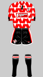
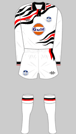
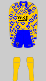
<<AFC
Bournemouth 1992
Bournemouth wore some attractive red and black
striped kits during the 1990s but 1992 was an exception,
with this shirt with its odd chevrons.
|
|
<<Bradford
City 1991
City have never been afraid to innovate with their
traditional claret and amber stripes.
|
|
|
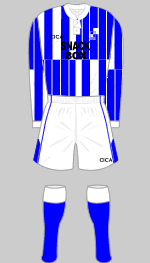
Brighton
& Hove Albion 1991>>
Striped shirts have been popular for over 100 years
but no-one had previously thought to combine striped
shirts and shorts. Here's why.
|
|
Bristol
Rovers 1996-1997>>
Combining their traditional quarters with their older
stripes was probably a mistake. Fans described this as
the Tesco Carrier Bag kit.
|
|
|
|
|
|
<<Chelsea
1983
Chelsea and French manufacturer Le Coq Sportif are
generally associated with elegant kits. In the early
1980s, however, good taste went out of the window.
|
|
<<Chester
early 2001
In 2001, Chester were at the foot of the Conference
despite their controversial owner introducing this new
kit in an attempt to rebrand the club. In October both
the owner and this kit were ditched.
|
|
<<Chesterfield
1998
Chesterfield have always been fairly conservative in
their choice of kits, at least until this effort with
fading stripes.
|
|
|
|
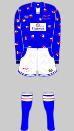
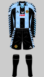
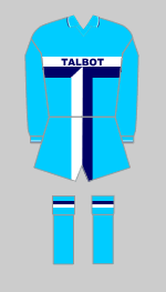
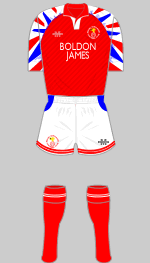
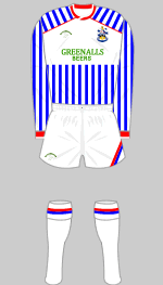
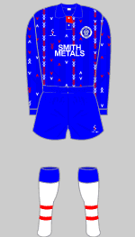
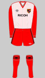
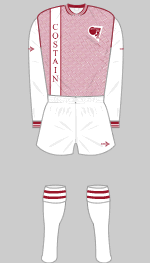
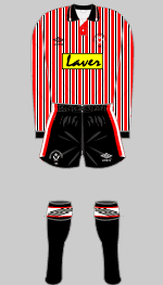
Coventry
City 1982>>
Coventry's infamous Talbot kit was an attempt to get
round the regulations that limited the size of sponsor's
messages on shirts by designing the entire kit around
the car manufacturer's logo.
|
|
|
|
|
|
<<Darlington
1992
This variation on Darlo's traditional hooped jersey
might have been best left on the drawing board.
|
|
<<Doncaster
Rovers 1992
An extraordinary variation of Rovers' hooped shirt,
in which the colours run into each other.
|
|
<<Everton
1985
The introduction of a white yolk proved deeply
unpopular with the fans and this kit was dropped after
only one season.
|
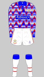
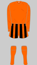
Hartlepool
United 1991>>
Love it or hate it, there is planty going on in this
kit, which manages to combine most of the combinations
of blue and white that the club has ever played in.
|
|
Huddersfield
Town 1987>>
It's hard to imagine why the Terriers abandoned their
traditional elegant stripes for this concoction.
|
|
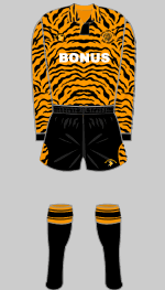
Hull
City 1992>>
"We play in amber and black and are called the
Tigers. I know, let's have a tiger print shirt." A
contender for the most truly awful shirt of all time.
|
|
|
|
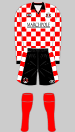
<<Leyton
Orient 1998
Several clubs adopted this chequered pattern for
their change strips but only Orient were bold enough to
feature it as a first choice kit. Someone must have
liked it because it was revived in 2001.
|
|
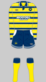
<<Luton
Town 1991
Luton's blue and orange period really
got out of hand with this kit.
|
|
<<Newcastle
United 1990
Designers have real trouble coming up with new
variations on the traditional striped shirt. You can
make them broader or more narrow. Or, as in this strip,
you can have both.
|
|
Northampton
Town 1989>>
The Cobblers have never been afraid to
experiment with novel designs.
|
 |
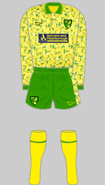
Norwich
City 1992>>
Norwich succumbed to the fashion for "paint
fleck" design but enjoyed some of their finest
moments in Europe wearing this kit. Known by fans as the
"bird poo" kit.
|
|
|
|
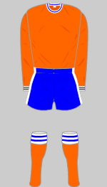 |
<<Oldham
Athletic 1966
In 1966 The Latics abandoned their
distinctive traditional striped kit in favour of this
gaudy contrivance of orange, blue and white.
|
|
|
|
|
|
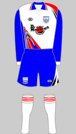
Port
Vale 1990>>
A strange way to combine black and white.
|
|
Reading
1991>>
The bizarre wavy lines on this kit gave the
impression of a badly tuned TV set.
|
|
Rochdale
1993>>
The irregular striped effect on the shirt is produced
by tiny chevrons, lined up vertically in irregular
groups. Perhaps it looked good with jeans.
|
|
 |
<<Rushden
& Diamonds 1998
Odd swirls and flashes make this Olympic
Sports designed kit a real oddity. Similar kits were
sported by Scarborough and Southend.
|
|
<<Scarborough
1997
Normally Errea produces attractive, well designed
kits, as one would expect from an Italian company. Not
this one though.
|
|
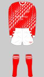
<<Scunthorpe
United 1983
After playing in white, blue and gold then all-red,
The Iron returned to their traditional claret and blue
with a bang. Or should that be a clang? Iron - clang -
see what I did there? Fans, however, regard this as a
landmark kit.
|
|
Sheffield
United 1990>>
Another variation on a stripe theme.
|
 |
|
|
Shrewsbury
Town 1992>>
Oh dear.
|
 |
|
|
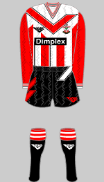
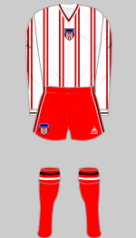
<<Southampton
1993
Sportswear design company Pony developed the large
"tick" as their trademark and it didn't look
too bad on plain shirts. Stripes were another matter.
|
|
|
|
<<Stockport
County 1993
If your computer screen looked like this you'd
replace it. One of the true horrors in the collection.
|
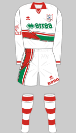
Stoke
City 1983>>
This ill judged attempt to reconceive a much loved
traditional shirt met with universal hostility from fans
and was abandoned after a single season.
|
|
Sunderland
1981>>
Yet another attempt to reinvent tradition. This
oddity lasted two seasons before Sunderland returned to
conventional red and white striped shirts with black
shorts.
|
|
Swansea
City 1992>>
This is one of several red and black extravagently
trimmed kits worn by the swans in the first half of the
1990s, before sanity prevailed.
|
|
|
|
<<Torquay
United 1993
An interesting take on Torquay's blue, white and gold
that might look more at home on the rugby pitch.
|
|
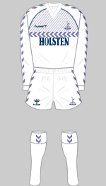
<<Tottenham
Hotspur 1985
Danish company Hummel arrived in England with this
strange design, ditching Spurs' traditional dark blue
shorts. These were reinstated the following season.
|
|
<<Walsall
1990
Another kit that defies description. Its basically
red and it has white diagonal pinstripes that changes
width and vertical stripes over part of the front and
they change as well and I think I'll lie down. Also worn
by Gillingham in blue.
|
|
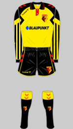
Watford
1993>>
A typically busy kit from the period,
there is a slightly scary robot feel to this outfit.
|
|
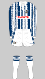
West
Bromwich Albion 1992>>
West Brom have worn some design classics
in their time so what possesed the mangement to adopt this
barcode design with wavy stripes? Opticians near the
Hawthorns must have done a roaring trade.
|
|
|
|
|
|
|
|
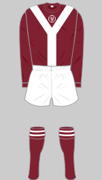
<<York
City 1974
The first of York's infamous "Y Front" kits.
A white version with maroon Y followed two seasons later.
|
|
<<Newport
County 1972
The Ironsides played to relentless wolf whistles from
their own supporters when they adopted this outfit.
After two games the players refused to turn out in these
ludicrous striped shorts and black ones were substituted.
|
|
Hibernian
1994>>
The Hi-Bees adopted their classic green
shirts with white sleeves in 1938 and have worn them to
this day, aside from two seasons when they were disfigured
with striped sleeves.
Nominated by Fraser Pettigrew
|
|
Dunfermline
Athletic 1992>>
The Pars traditional colours are black and stripes
with red trim. This version, featuring faded blotches is
probably best forgotten.
|
|
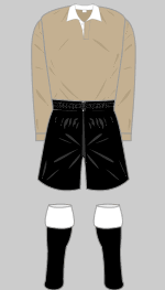
Clyde
circa 1946>>
Clyde's traditional colours are white and black with
red trim. According to some sources they played in khaki
shirts immediately after the Second World War.
Presumably they thought that camouflage would prevent
their opponents from spotting their players.
|
|